Thursday, 8 December 2011

Assignment 2 - Point of Sale


The brief for this assignment was to create images that could be used in a campaign for a supermarket to package and promote a range of seasonal foods.

I started off with two mood boards, one for 'autumn' and one for 'summer', gathering images from the internet, to spark off some ideas.


I tried out some colour sketches, so that I could decide whether I was going to use fruit/vegetables or both.

After doing the colour work, I did a couple of rough sketches, trying out some ideas for the illustration layouts.  The autumn one set in a vineyard, and the summer one in a  meadow.  But as my ideas began to take shape I changed my mind on both of these.


Next came the idea of making things simpler, by just having  a still life arrangement, with lettering underneath.

This last illustration for the autumn one I decided was too busy, so I went with a different more simple layout, using a basket filled with grapes, and pears and apples in front of it.

The 'summer' illustration was going to be based around a jug and bowl set with fruit tumbling out of the jug into the bowl, with other fruit sitting around the outside.

To obtain the bright colours I used acrylic paint, building up the colour of the fruit as I went.

Summer

Autumn


After experimenting with layouts, colour and content I am very pleased with the outcome of both the Summer layout and the Autumn layout.  I have shown many people both designs, during the art club sessions that I attend, and they agree that the colours are bright, and eye-catching.

In conclusion, it is better to try out several different ways of doing a brief, using the mood boards as a way of researching, but also asking public opinion, have been important factors for me in this assignment, because at the end of the day the public are the ones that will have to be enticed by the display, and if it isn't right it will not encourage them to buy.


Wednesday, 7 December 2011

Exercise - Visual Metaphors


For this exercise, we were asked to draw objects/subjects, to illustrate one of the phrases listed.
I chose the phrase 'reaching retirement', and firstly made a spider diagram to produce more words to work with.
From this I came up with some very basic sketches, not too detailed, but enough detail in them that you could further develop, I added a bit of colour just so you could see what the items were meant to be.


When I had drawn several sketches around this idea, I showed them to someone else, to see if they could identify what they were about, they had no trouble, even though the illustrations were very raw and basic.
I feel that the results were good from this exercise, but I was unused to not producing a more finished illustration.  If I was to take one of the ideas further I think the one I might have gone with would have been the last one, with the businessman running through the retirement tape, throwing his briefcase in the air as he does so.


Exercise-Choosing Content

If this were to be made into a film, what would the main character be like?

I looked on the Internet and black-and-white films of this era, the 1940s, and came across many actors-Humphrey Bogart, James Stewart and James Cagney, playing gangster/tough guy characters.

I think that these actors would have many of the qualities that the main character might have.  Tough exterior, passionate about his job, may be a bit of a tough guy, perhaps getting into scrapes through his job with new Scotland Yard.

This may be etched on his face, lines, greying hair despite his years, tired looking from many late nights on difficult cases.  Rugged looking, slightly crumpled clothes, tidy loose, and hair ruffled.

What clothes with the character be wearing?

Shirt, tie-loose end at the collar, suit trousers, with turn ups, double-breasted suit jacket which would be on the back of the chair.  A trilby style hat and long raincoat hanging on a hook on the back of the office door.

What furniture is in the main area in which the action takes place?

Because this is an office, there would be a desk, chair, (perhaps a wooden swivel one) a filing cabinet, hat/coat hook and may be a settee/couch.  Quite spartan, no frills.


I decided that because the era was probably the 1940s (because of the reference in the text), that I would go with the sort of effect that black and white films from this period had.

Many of the films were ' film noir' so the drawing I wanted to produce would have this effect too.  Lots of shadow would be needed to give it a dramatic feeling.

I created 2 mood boards showing some of the elements I wanted to include in my illustration, such as clothing, scenery, tonal values, and texture.

I used cross hatching and pen in ink, to produce the effect I needed after trying out solid black and deciding I didn't like it, because it was too heavy and I couldn't vary it enough, or give the appearance of texture.


In conclusion the piece turned out well, I managed to include some of the descriptions of the office area, a view of St Pauls, and bombed out buildings, plus some of the things I felt should be in the illustration, such as items on the desk.


The character is drawn so that he is surveying the war torn city buildings outside his office window, particularly the smoke shrouded St Pauls Cathedral, an iconic image of the war years.


Exercise - Using Black and White

For this exercise I chose the word ' sea' to illustrate.


I have watched many 'sea' based documentaries on the television and also the film ' The Perfect Storm'.

I decided that the illustration should involve a fishing boat being tossed around on a stormy sea, possibly with a large tidal wave about to engulf it.

I wanted some help with a large wave, so I looked at Hokusai for inspiration.


I used this picture as the basis for my wave shape, although I had to simplify it as some of it would not come out in the cutting out stage.


Also these two reference photos were used in the illustration, the top one of a fishing boat, ' The North Western' from a documentary called ' The Deadliest Catch'.

Once I had drawn out a rough sketch, then I worked on the final idea.


I had one problem to overcome, I cannot print out A3 size illustrations, so I had to find a different way or only produce and A4 drawing/illustration.


I asked at my local photography shop as I knew they could photocopy to A3 size, but they did not have an invert button, so they came up with the idea of doing it on their computer and printing it off.  This they did at the cost of £6.80!

I cut out the pieces I wanted, but discovered that the black image was slightly smaller than the white image, so I had to come up with another solution-I used Tip Ex to whiteout any black lines left in view after the Black had been placed, not ideal, but it did work.

I chose to place quite a lot of the black on the white because it makes the image look ' Stormy', just the right setting.


I checked the image before I stuck it down, and all so in the mirror when it was finished.

Despite the problems I had getting a final image I have managed to finish the exercise satisfactorily, but if I had have got an A3 size printer, it would have been much simpler!


Exercise - A subjective drawing


Finished Illustration


For this I have chosen my skagen watch as the item I'm going to use for the subjective drawing.

I have produced a small spider diagram so that I can come up with some words relating to the watch.  I will pick one word and make the mood board from my idea.
My mood board for this exercise was comprised of adverts for skagen watches, including the one I have, a black-and-white photograph of a steelworker, and the process of steelmaking.

I also included samples of the materials I wanted to use.

I have chosen the word ' shiny' from my list of words and I thought the best way to describe this word was to use collage.

I saw at John Lewis', some very striking silver wrapping paper, so this was to be the background for my collage, I also wanted a contract sting silver, so I picked silver foil as this has a smooth quality-a great contrast to the textured background.  Black and white paper would be used for other details in the piece.

I scanned the line image of my watch design, which was based on my model of watch, cut this out and stuck it on to the silver background.  I then added the silver foil, which was not easy, and the black paper.  I finished the image with some black pen detail and black lettering.

Overall I am pleased with the image, I haven't done much collage work, but I feel this went reasonably well and turned out okay.  The drawback of this exercise was the four-wheel was difficult to cut.

Skagen watches are based around steel, says this is the shiny surface I wanted to portray, with the materials are used, and I think I exaggerated this very well.


Exercise- An Objective Drawing


For this exercise I chose one of my new boots that I have bought for the winter, to draw.  Using pencil, I set the boot on a piece of white paper at an angle and roughly sketched it, adding more detail as I went on to describe the fabric and creases in material.  I have drawn many things from still life in the past so this exercise was not difficult, but the only thing that was difficult was the angle, but I think I have done a fair job.


Exercise - Exploring Drawing and Painting

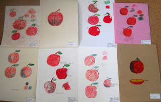
I gathered together several different pieces of paper to tackle this exercise, food colouring, oil pastels, cheap felt pens, wax crayons, and a ballpoint pen as my media.

Also included for this exercise were brushes, pen and nib, white spirit, water and linseed oil.

I attempted to produce a few drawings of an apple on each of the pieces of paper using cross hatching, and stippling techniques.  What I did find was that my drawings were crude representations of an apple, because either the paper did not support the media very well or the media itself was clumsy to use.

A lot of the paper surfaces were very porous so they soaked up the media quickly, especially the felt tip pen, food colouring and the pastel if it was blended using the linseed oil and the white spirit.

It was difficult to move away from what I am familiar with, but it was a good exercise in experimentation, which I have not done much of in my art work.

It has changed my outlook as to what illustration can be all about, as I had always assumed it had to be based around painting and drawing or computer drawn images.

I am not wholly comfortable in producing an image this way with these materials, but perhaps I may try a different base (paper) for my paint, pencil or pen and ink.

In conclusion a good exercise in experimentation, but not something that I would have chosen to do.

Friday, 2 December 2011

Exercise - Using Reference - Final Illustration

We had to produce an illustration of a person sitting in a chair surrounded by artefacts of the 1950s.

I decided to use some of the photographs I had collected to produce the illustration.  I did a couple of rough sketches-A4 size, to get an idea for the final illustration.  I included all of the areas, transport, TV and film, interiors, architecture, people and costume.

I painted the final illustration in acrylic paint to give it a colourful feel, even though a lot of the photographs I had, where black-and-white.

I enjoyed this exercise, discovering things I did not know about the 1950s, especially how this country has evolved from that time, and how many things are now coming back into fashion, labelled as' vintage'.

I produced an A3 size illustration for this as I felt it would be better at this size so that you could identify the items easily.

However, the original illustration I produced, I was not happy with, so I redid the exercise, producing an illustration with a different layout, which I felt fulfilled the brief that was given.

In conclusion, sometimes it is better if you are not happy with something, then it is always worth going back over what you have done and the instructions that you have been given.


First Illustration

Second Illustration


Exercise - Using Reference

 I have created some mood boards with images from the 1950s, and put them into the categories listed, so that I can create an illustration to give a modern teenager an idea of the 1950s.

I discovered that after the war years of the 1940s, Britain started to evolve rapidly, people seemed eager for change.  It was greatly influenced by America through film/TV, clothing, and famous people such as Marlon Brando, Elvis Presley, and James Dean.
Teenage years were particularly influenced by these idols, because they were keen to rebel against authority.  Gangs of Teddy boys, frequently' ripped it up' damaging property etc.

Britain and America became interested in space travel, although nothing was achieved until the 1960s, so much was made about aliens from outer space in films, plus was born science-fiction, films that were now in colour helped this.

Fabrics and wallpaper were adorned with large motifs and abstract shapes in bright colours.  Household interiors changed, open plan sitting rooms, modern Melamine furniture sat in dining rooms and linoleum was put down on kitchen floors.

The future was important for the 1950s person, because they had emerged safely from the war years, things were being taken off ration, manufacturing, building and research was going through a boom period.

In the art world too, things were going through a change in the' abstract Expressionist' movement was formed with artists such as Jackson Pollock,Willem de Koonig, and Franz Kline.  There were all so artists that started the ' pop art' trend that was to make Andy Warhol famous in the 1960s, artists included Eduardo Paolazzi, Richard Hamilton and Jasper Johns.

As the 1950s went into the 1960s many of the things that were started carried on at a great pace.  Television became more affordable, alongside cars to many more people, the further the country got away from the war years.

New synthetic fabric, modern production methods, made clothing more varied.
With more money in their pockets young people set out to have a good time.  The 1960s was a time of remarkable, cultural upheaval. Attitudes changed towards class, colour and sex.  People became more outspoken, this was the time when the CND introduced the ' ban the bomb' phrase at demos.

So from the 1950s the country began to progress and change from the life it had had before, it used the opportunity created by the war years, to start again.

Today in the 21st-century we are now more interested in our past, many of the things we buy have roots back in the 1950s.  Vintage clothing is a booming business with many well-dressed women wearing original clothes or reproduction ones from the 50s.  Many of our kitchen white goods have a design influence from around the 50s/60s, large American style refrigerators from that period have made an appearance in today's kitchen.

Classic cars have always been popular, and with the many car rallies and exhibitions it is possible you may see many vehicles from this time.

In conclusion the leaps in technology, design, art, fashion and advertising made in the 1950s, are still influencing these areas to date.

Interiors and Exteriors
Clothes and People


Films and Television

Transport

Advertising

Art